New Visual Enhancements, Improved Clarity & Bug Fixes Across Reports and List View
We’ve launched several design and usability updates to make Smart Visibility even more polished, informative, and user-friendly. From clearer chart labels to better tooltip placement, here’s what’s new:
📊 Clarified Trend Line Labeling in Reports
To help clarify what you’re seeing in trend charts:
- The legend label “Trend Average” is now updated to “Current Year Trend Average” in both the Order Trends and Receipt Trends reports.
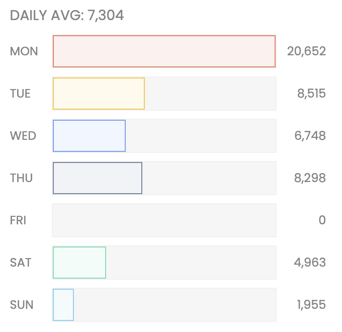
📈 New Daily Average Component in Receipt Trends
We’ve added a vertically scrollable “Daily Average” component in the Receipt Trends report to help you quickly spot weekday trends.
What’s included:
- Color-coded bars representing average counts by day (Mon–Sun)
- Real-time updates based on applied filters and timeframes
- Actual daily averages displayed on or above each bar
🗺️ Improved Tooltip Positioning in 'Orders by Location' Report
Tooltips in the Orders by Location map now appear offset from your cursor, so they no longer block the state you're hovering over. This fix improves map readability across all screen sizes and zoom levels.
🧾 Updated Summary Card Tag Styling
We fixed a minor visual bug where the count inside summary card tags appeared off-center. Numbers are now perfectly vertically aligned, providing a more polished and consistent look.
✨ Design Refinements
Platform-wide font has been updated to Poppins for improved legibility.
🛠️ Maintenance Mode Experience for Reports
When Smart Visibility undergoes scheduled maintenance for Reports, users will now see a clear Maintenance Mode UI letting them know the platform is temporarily unavailable.
These updates are part of our ongoing commitment to improving usability, visual clarity, and platform stability. As always, we appreciate your feedback - got an idea? Please submit one! 🚀